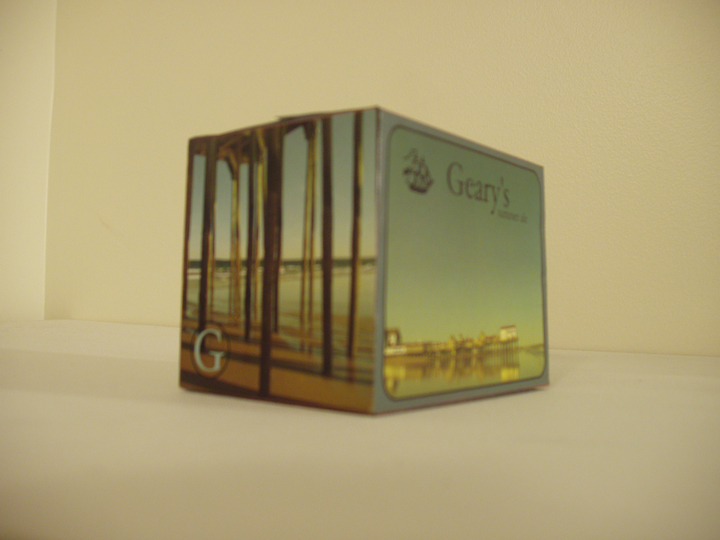
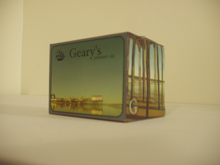
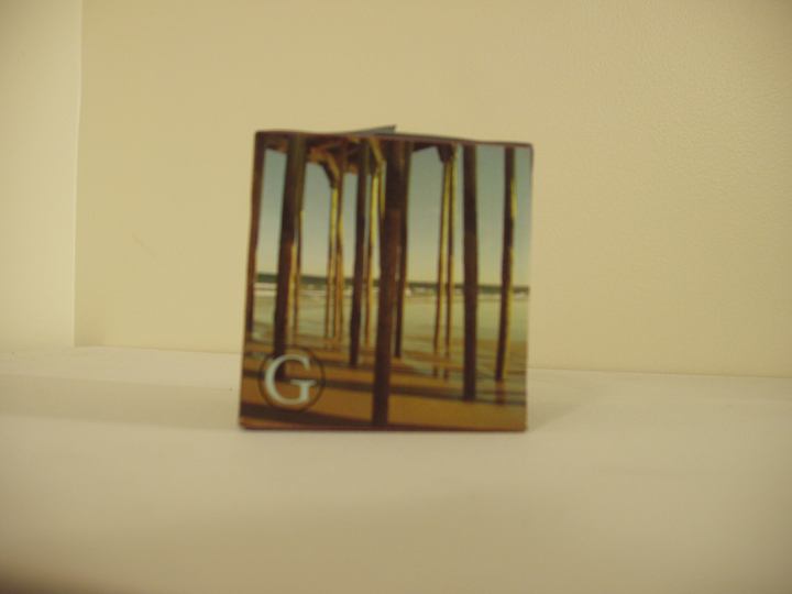
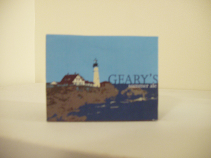
These are the finalized geary's Summer Ale templates before I printed them out and made full size mockups, I'll post the real mock ups later, I wasent able to take pictures of them before turning them in for judgeing, cus I was up till 3am finishing them the night before. I'm very happy with the way they turned out, especially the top one. This was the first time I have ever made something fit a template and actually print it out and make it into a real box and bottle label, so it was a good experience and I think I learned alot from this project. Alot about how things look and balance eachother out with the text and image, and color choices. The smaller rectangle images are the labels for the bottle. Click on the image and you will be able to see them more clear.
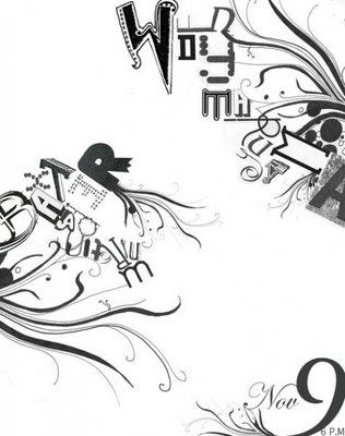

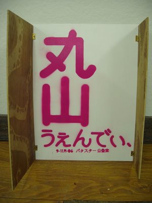
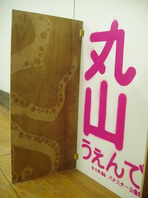
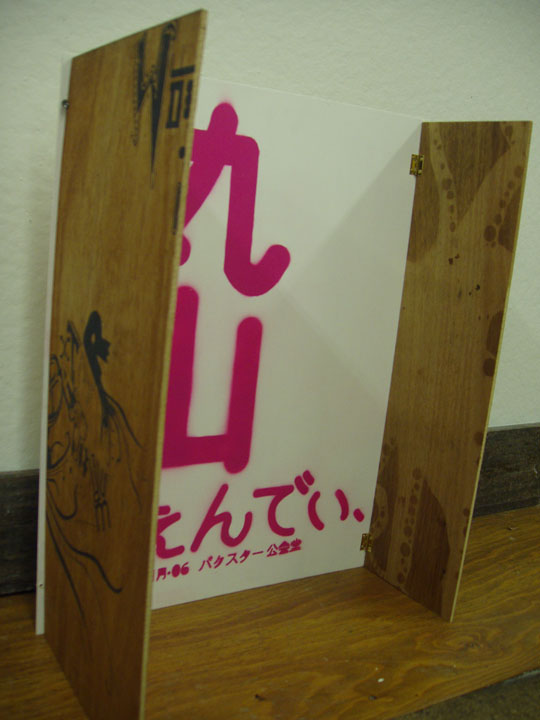
 This is a poster which my studio class designed for an incoming artist at the school, the artist is a furniture maker and has alot of doors and sliders in her work, so we incorporated an opening door for the poster so it could be read from the outside and opened up with more text. The outside is screen printed on wood, which made for an interesting look, and is something that I've never printed on before. The inside is spray painted Japanese text for her name, date and place of the event. The inside also has octopus lets and tentacles spray varnished on it through a stencil that we made. I'm pretty happy with the way it came out, I definitely see flaws in it now that its done, but hey, what are you gonna do. It was a fun assignment, just a challenge to take 10 different people's ideas and make it into one without leaving anyone out.
This project also showed me the screen printing dept. at my school, which i wasn't to familiar with since i transferred here and haven't been able to take a printmaking or screen printing class. So I think I'm definitely going to be working more in there making some posters of some sort hopefully very soon!


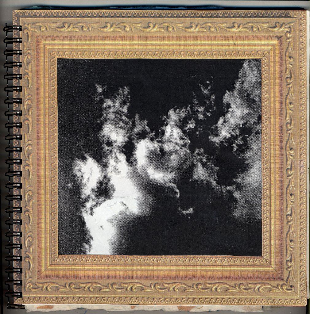
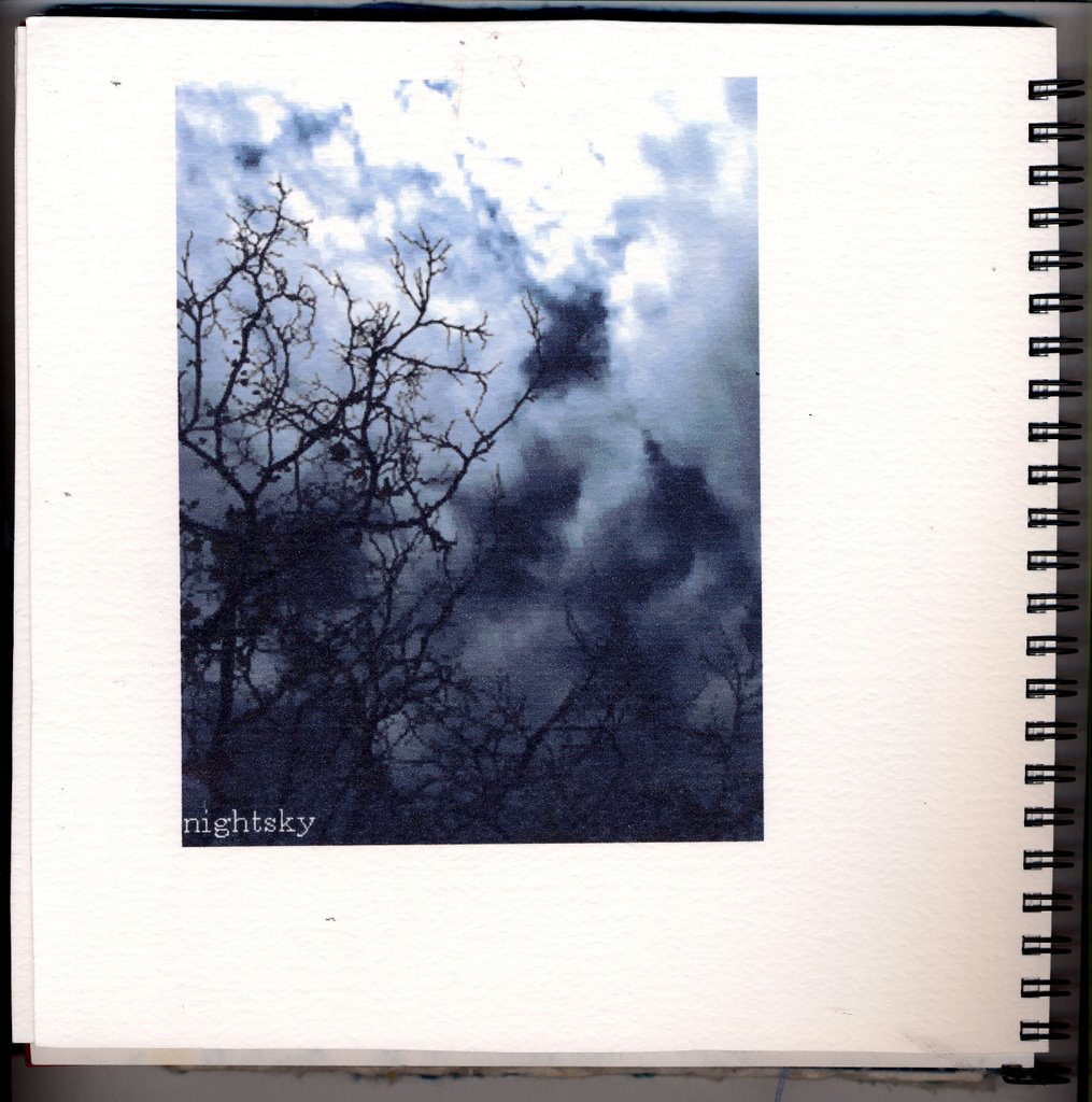
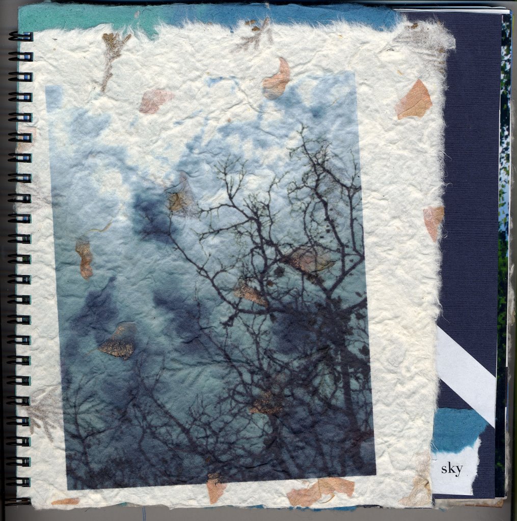
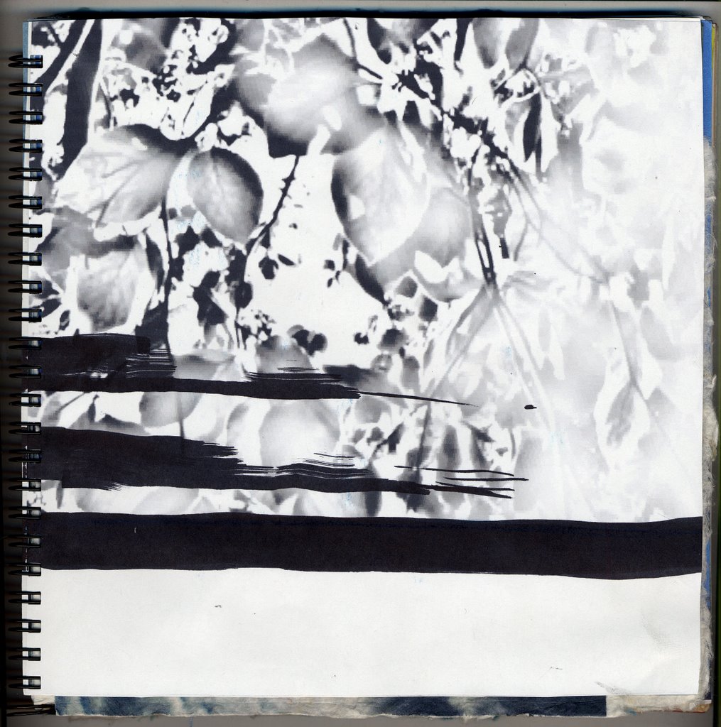
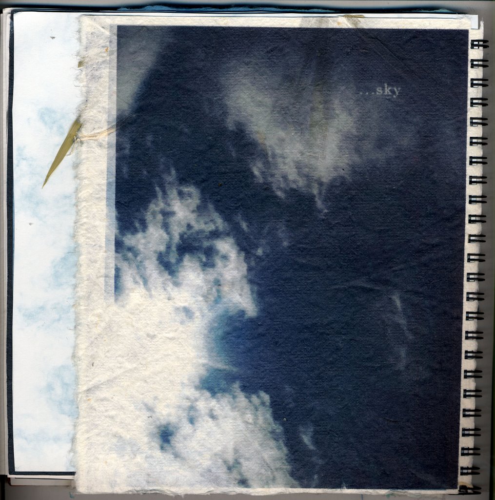
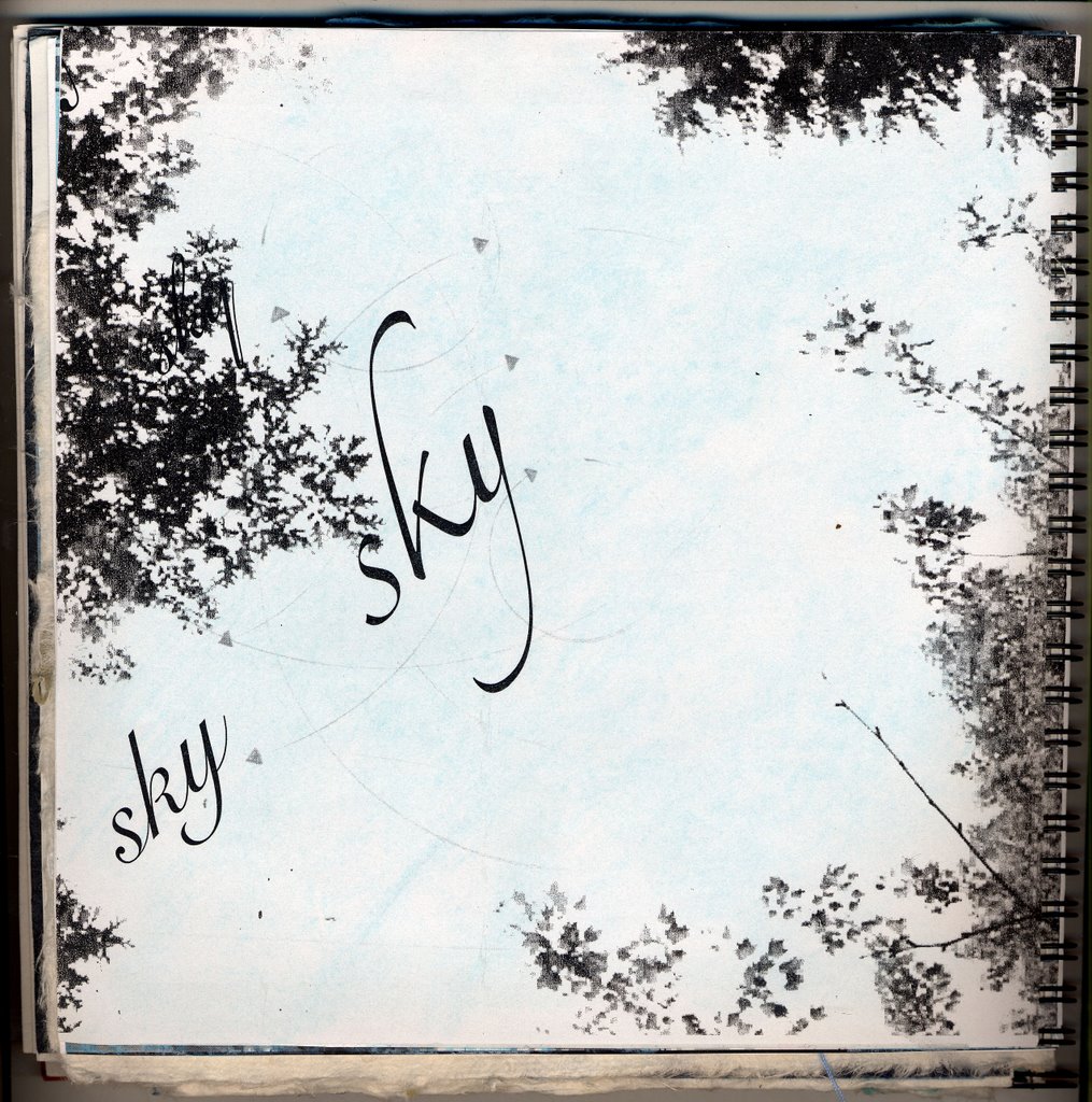
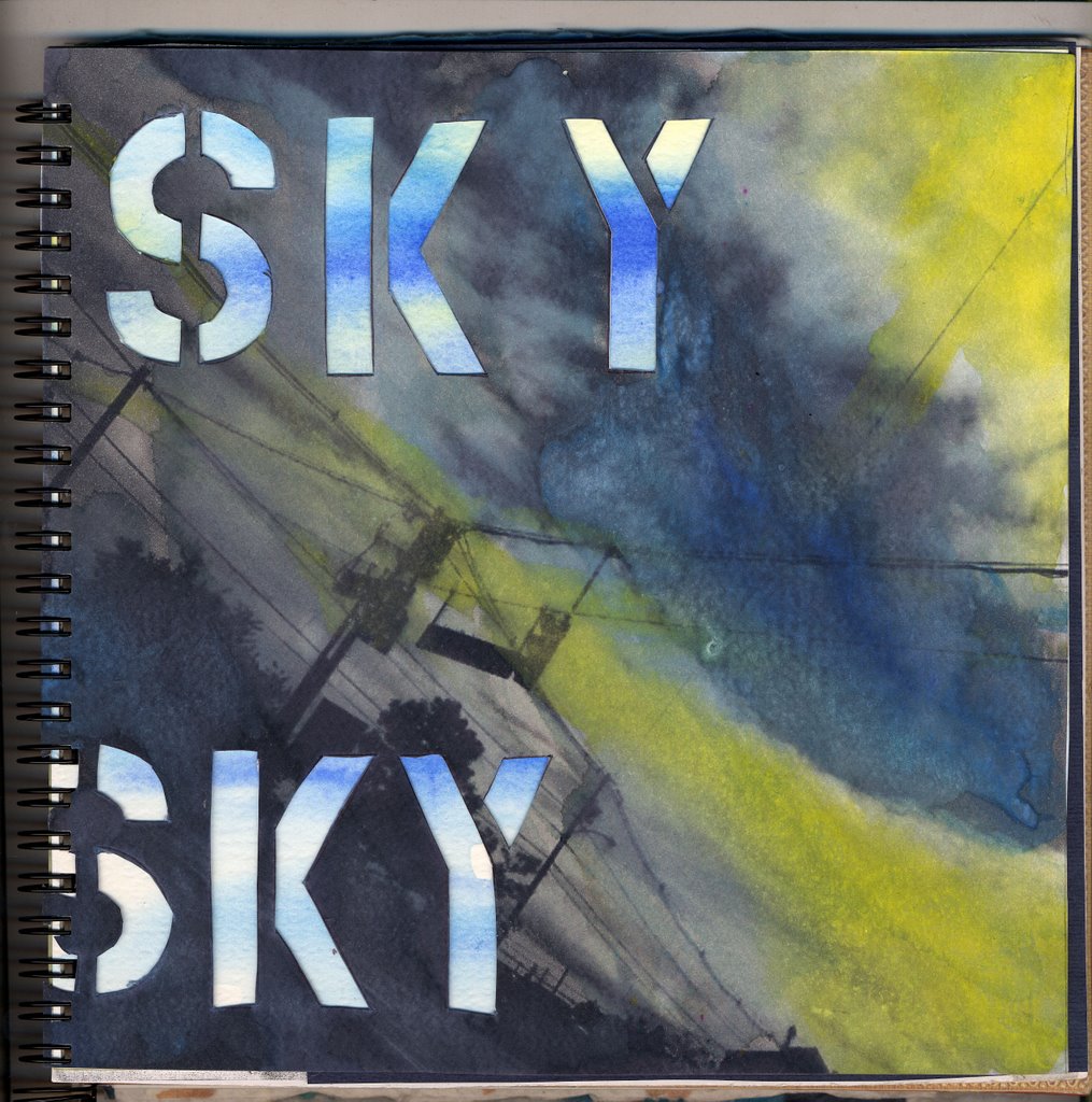
 i've been making 2 sculptures for my text in the environment class which are going to hang in a local book store called Casco Bay Books, one if pretty much done, here are some pictures of it before its going to get hung up. There going to hang from above so you will only see it from the bottom. Its made out of foam core and tracing paper, with 2 wooden dowls.
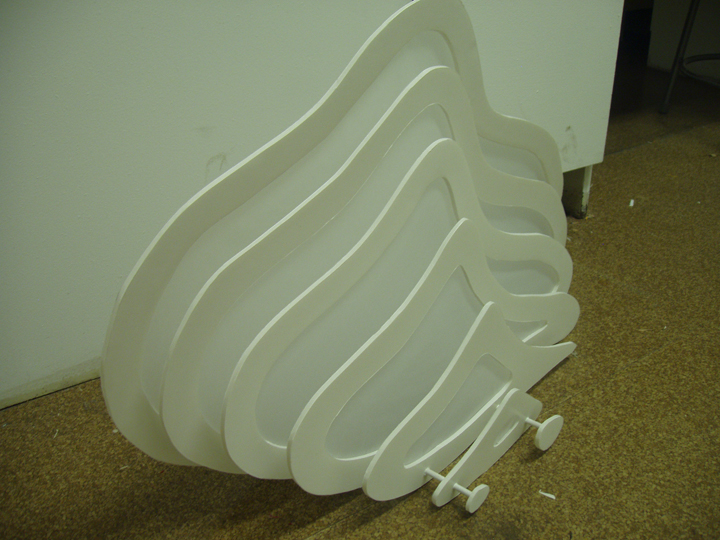

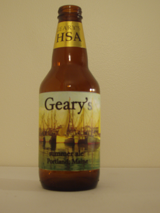
 this is what i'm drinking.